
Problem Statement
"Financial analysts and novice users face challenges in performing accurate drawdown analysis due to complex data interpretation, lack of interactive visualization, and inconsistent benchmarking. The goal is to design an intuitive, user-friendly drawdown analysis tool that seamlessly integrates financial metrics, risk assessment, and comparative benchmarks, while catering to both power users and beginners with tailored visual elements and actionable insights."
Project Goal
The goal of this project is to design a versatile drawdown pattern for both financial analysts and novice users. It supports financial risk management tasks like stress testing and client reporting. The aim is to make complex drawdown analysis intuitive and accessible.
Process

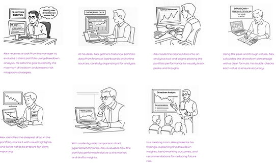
Storyboarding after discovery
A day in the life of financial analyst:
Scenario 1: Alex is asked to assess a client portfolio. He goes through the process of data gathering, charting drawdown trends, calculating the deepest loss (maximum drawdown), and presenting the results in a risk report. This helps the team prepare mitigation strategies for volatile markets.

How might we (Top 7)
-
How might we make complex drawdown analysis feel effortless, even for non-experts?
-
How might we help users get started with one click instead of setting up everything manually?
-
How might we give power users more control over graphs and data without confusing novice users?
-
How might we turn raw financial data into meaningful insights automatically?
-
How might we alert users when something looks off, and suggest how to fix it?
-
How might we enable multiple stakeholders to collaborate on the same analysis?
-
How might we let users test “what if” scenarios in a simple, intuitive way?
Solution scoping

Impact vs Effort
.jpg)